cal.com
Cal
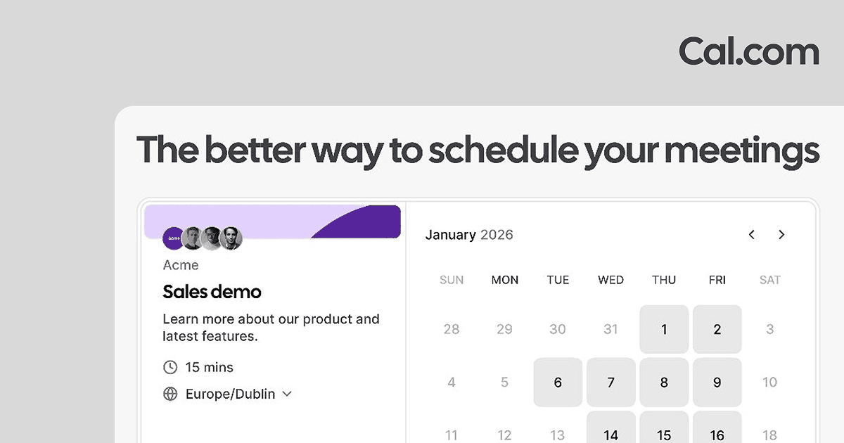
Cal.com keeps things light and practical. Their Open Graph image uses a soft grey background, the 'Cal.com' wordmark in the top corner, a bold heading 'The better way to schedule your meetings', and a clean booking-page screenshot showing a real calendar and a sample event. The product shot does the convincing while the headline frames it. If your tool is something people need to see to understand, this headline-plus-screenshot layout is a reliable pattern to borrow.
What you can borrow
- Lead with a plain-language headline, then show the product
- Use a real screenshot to make the value obvious
- Keep a light, neutral background so the UI stands out
The specs
- Headline
- The better way to schedule your meetings
Inspired? Build your own OG image.
Start from a blank canvas in the free, no-code editor. No signup required to try.